Some of the Key features in Seaborn are: - Built-In Datasets - Default Colour Themes - Simplified Code
📌 Built-In Datasets
Seaborn provides access to a collection of built-in datasets. These can be used to demonstrate Seaborn’s functionalities and data visualization capabilities.
We can load a built-in dataset from Seaborn using the following code:
# Loading librariesimport seaborn as snsimport matplotlib.pyplot as pltimport pandas as pdimport numpy as npflights = sns.load_dataset('flights') # Load the 'flights' datasetprint(flights.head()) # Printing the first 5 rows of the dataset
   year month  passengers
0  1949   Jan         112
1  1949   Feb         118
2  1949   Mar         132
3  1949   Apr         129
4  1949   May         121
📌 Default Colour Themes
Seaborn provides some default colour themes and palettes, making it easy to plot visually appealing graphs. We can also create and save our colour themes and palettes for future use.
Some examples of these colour themes are ticks, whitegrid, darkgrid, dark, and white. Some examples of the colour palettes are pastel, bright, muted, and deep.
The colour themes enhance the font colour, background colour, gridlines, and the overall appearance of our plots to make them look cleaner.
These themes and palettes can be used in the following way:
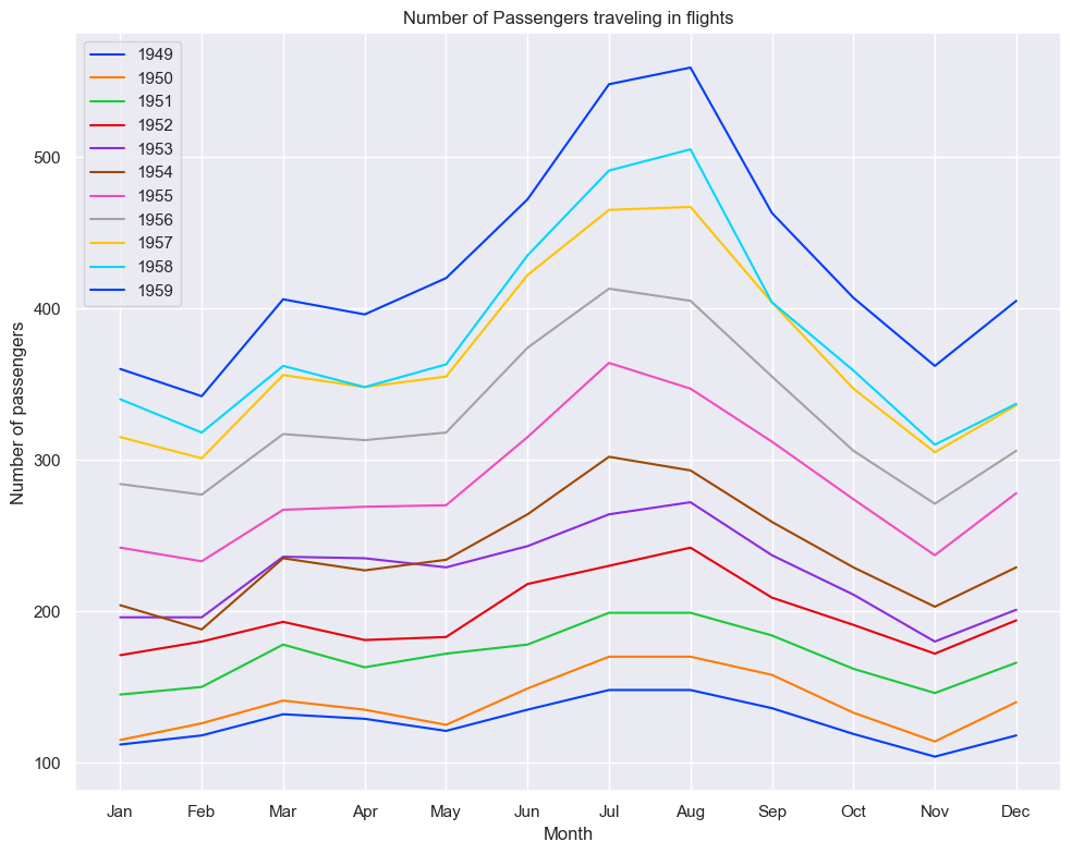
# Applying darkgid themesns.set_theme(style="darkgrid", context="notebook", palette='bright')plt.figure(figsize=(10, 8))for y inrange(1949, 1960): plt.plot(flights[flights['year'] == y]['month'], flights[flights['year'] == y]['passengers'], label=f'{y}')plt.xlabel('Month')plt.ylabel('Number of passengers')plt.title('Number of Passengers traveling in flights')plt.legend()plt.tight_layout()plt.show()
The above line plot shows the trend of the number of passengers traveling over months for years from 1949 to 1960.
📌 Simplified Code
Seaborn is designed so that it is easy to visualize data while working on some datasets. Seaborn can support several different dataset formats, which are usually stored as objects of Numpy and Pandas libraries.
Seaborn will take care of small details like colours, legends, and labels while working with datasets, enabling us to plot complex graphs with fewer lines of code than Matplotlib.
We will see the implementation of this property later in this blog while talking about the Regression plot.
Now let’s explore some plot types that work effectively in Seaborn.
📌 Regression Plot
This type of plot is helpful if we want to study the relationship between variables. Seaborn has a function regplot(), which can be used to plot regression plots, making it easier to understand the relationship between variables and fit a linear regression model for the data.
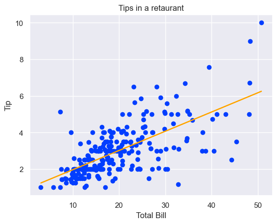
First lets plot using Matplotlib:
# Loading the built-in datasettips = sns.load_dataset('tips')# Plotting the scatter plotplt.scatter(tips['total_bill'], tips['tip']) # Using numpy to get the slope and Y-intercept of the Regression lineslope, y_intercept = np.polyfit(tips['total_bill'], tips['tip'], 1) # Plotting the regression lineplt.plot(tips['total_bill'], slope * tips['total_bill'] + y_intercept, color='orange') plt.xlabel('Total Bill')plt.ylabel('Tip')plt.title('Tips in a retaurant')plt.show()
As you can see, we needed 8 lines of code to plot a regression plot using Matplotlib. Below, you can see how Seaborn can generate the same plot in just 2 to 3 lines of code. This demonstrates Seaborn’s simplified coding feature.
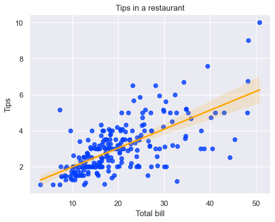
tips = sns.load_dataset("tips")sns.regplot(x='total_bill', y='tip', data=tips, line_kws={'color': 'orange'}) # Create a regression plotplt.xlabel('Total bill')plt.ylabel('Tips')plt.title('Tips in a restaurant')plt.show()
The above graph shows how individuals’ tips vary based on the total bill. The orange line is the regression line, the best-fit line for the data, and tries to capture the overall trend.
The orange-coloured shaded region around the regression line shows how reliable the regression model of our data is. The wider the area, the more the uncertainty of our regression model.
Using line_kws, we apply orange color to our best-fit line.
Also, you might be wondering why the darkgrid colour theme was applied even though we have not used any theme in the above code snippets; it is because once sns.set_theme() is called, it sets the theme as the default theme and applies it all the plots.
📌 Violin Plot
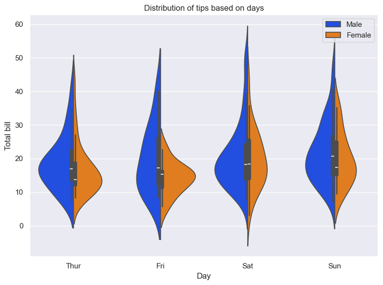
A violin plot is a mix of a kernel density estimate (KDE) plot and a boxplot. It is beneficial when we want to compare statistical data over multiple groups in a dataset. They help visualize the data’s spread, density, and shape.
plt.figure(figsize=(8, 6))sns.violinplot(x="day", y="total_bill", hue="sex", data=tips, split=True)plt.xlabel('Day')plt.ylabel('Total bill')plt.legend(loc='upper right')plt.title('Distribution of tips based on days')plt.tight_layout()plt.show()
In the above plot, we compare the distribution of total bills between males and females for each week. The wider area tells us about the concentration of data. It also speaks about the shape of the distribution.
We are using hue=“sex” to plot the distribution separately based on the sex of the customers.
Further, we are using split=True to split the violin graph into two parts and show them side by side for easy comparison.